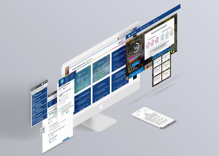
Senior Wellness Assessment
The existing health assessment made seniors feel like a diagnosis. We rebuilt it to make them feel like people, and opened a new market in the process.
Company
WebMD Health Services
Responsibilities
Principal Design Lead; Research; Product Management
Deliverables
Full mobile/desktop redesign; six-principle design framework; printable PDF results report; User research; Market research; Clinical survey design and review; CMS compliance
Impact
- New segment opened the Medicare Advantage market, making us one of the first to market
- Easier to use questions, especially on digital, were structured and organized in an easier to read format. Simpler language, grouping related questions together, and chunking made it less distracting and easier to complete
- The new standard the robust re-vamp became the standard for the core assessment products
Overview
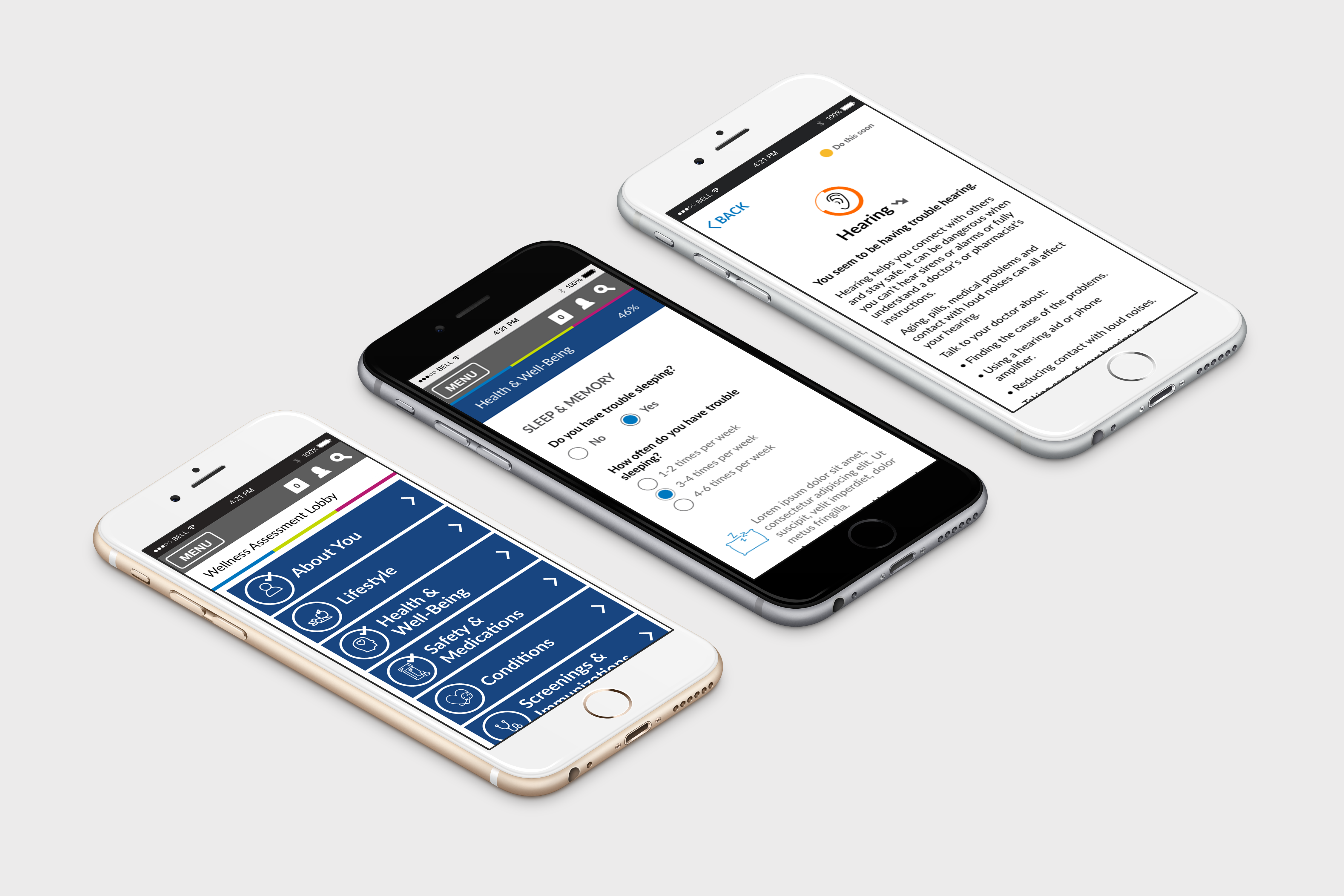
I led the research and design that made the company’s wellness assessment work for a senior population. When my product partners moved on midway through, I took over product management too. Working with engineering and clinical partners, we opened the Medicare Advantage market in the process. We also treated print as a first-class experience and made the imagery human and inclusive. Both were about access and dignity for people who had been poorly served before.
This wasn’t a visual refresh. It was a ground-up rethinking of question content, cognitive load, results architecture, and the behavioral science that motivates health behavior change. Together we also achieved CMS compliance for the first time. The patterns established here became the proof-of-concept that the Wellness Assessment (WebMD One) later scaled across all segments.
Objectives
- Lead the team in building WebMD's first CMS-compliant senior wellness assessment, purpose-built for Medicare Advantage, opening a new line of business
- Reduce cognitive load and time-to-complete through heuristic improvements, question reordering, and behavioral science integration informed by direct research with seniors
- Design a dual-format experience, digital and print, with a results report and physician summary that seniors can bring to their next wellness check, including people who don't use computers.
- Establish design patterns robust enough to become the standard for all WebMD health assessment experiences
The Details

WebMD’s existing wellness assessment had been built for a general adult population and failed seniors in two critical ways:
- Universal heuristic problems hurt all users: context switching, unclear status, high cognitive load, ambiguous results.
- Gaps in wellness areas critical to seniors: fall risk, mobility, medication management, and other health factors predictive of Medicare-relevant outcomes.
I led the research and design to build that from the ground up, with engineering and clinical partners alongside. I also saw an opportunity in the scope of the work to establish patterns that could benefit all of WebMD’s health assessment experiences, not just this one. The imagery was part of that response. We focused on seniors thriving, across a wide range of ages, lifestyles, activities and races, instead of dated stereotypes.
A critical identity finding shaped the entire visual and language strategy. Seniors resisted experiences that felt clinical or foregrounded age. They used words like "institutional" to describe the legacy product. The response wasn't cosmetic. I led the redesign of imagery, language, and results framing around empowerment rather than limitation.
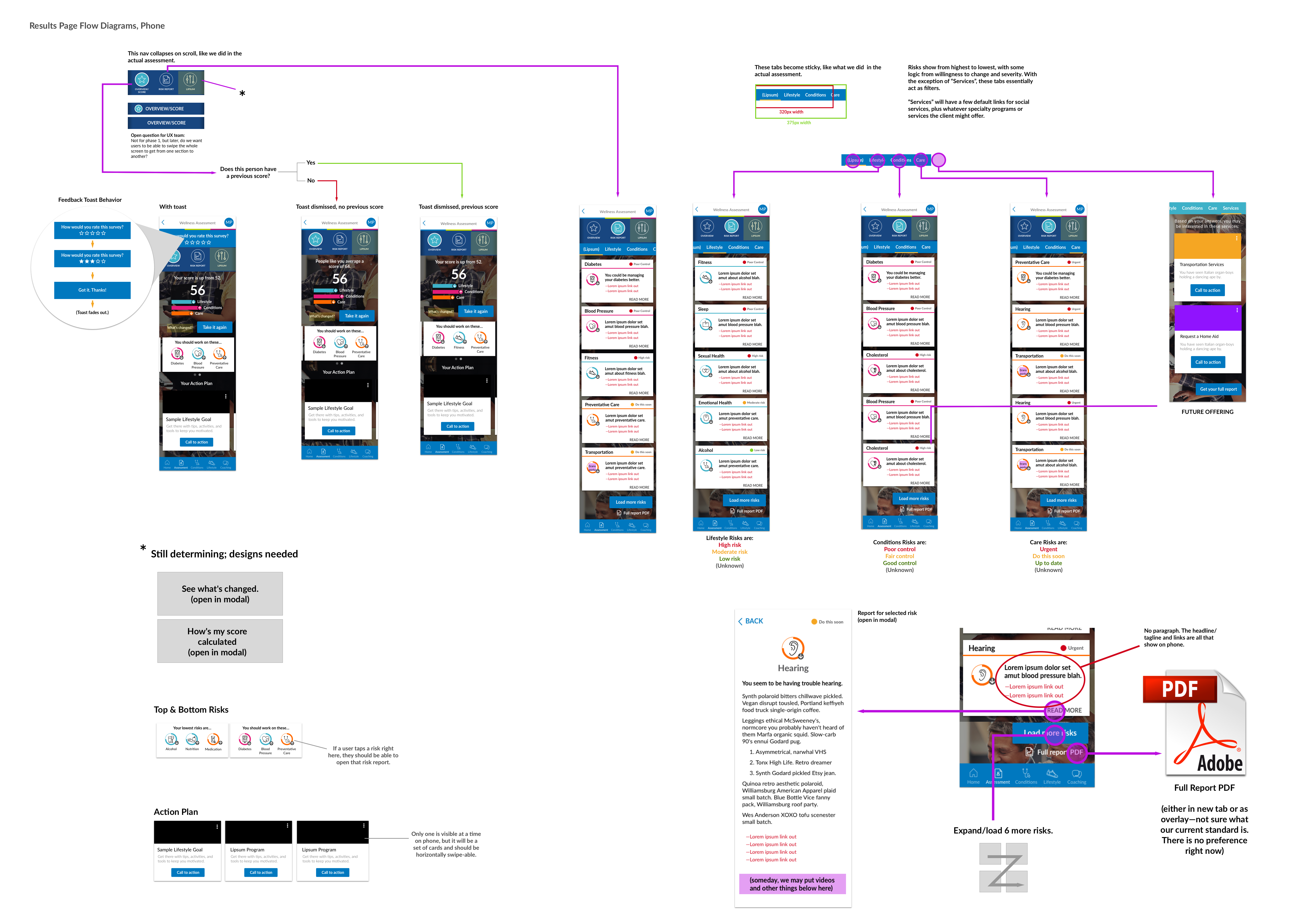
Behavioral science was a foundational part of our new experience. We made status more visible throughout the experience, including the landing screen, using endowed progress to encourage completions. We distributed willingness-to-change questions throughout the assessment rather than front-loading them at results.
Print was an incredibly important piece of the puzzle. In addition to the digital experience, we needed a print version of the assessment with a results report. It needed to minimize page counts and be consistent across different question sets and languages, and balance. We restructured and reformatted the questions and results to reduce context switching, drive consistency between experiences, and flex with different question set combinations. With the redesign we also did a major overhaul on the content to be more inclusive, easier to understand, and somehow more brief. We built these improvements into every version, but print is where they reached the people who needed them most.
The biggest value add in the results report was a physician summary. While the results report helped more clearly communicate results, users still needed to know what to do next. Self advocacy and wellness conversations can be difficult. The physician summary was an artifact users could take to their next wellness check to use as a conversation starter with their clinician, which many people struggle to do. It gave them a clear picture of their health and a way into the conversation.
The approach
I led the redesign of the full experience across mobile, desktop, and print based on the following design principles:
- Improve basic heuristics
- Reduce cognitive load
- Make it personal and empowering
- Use behavioral science
- Encourage and persuade
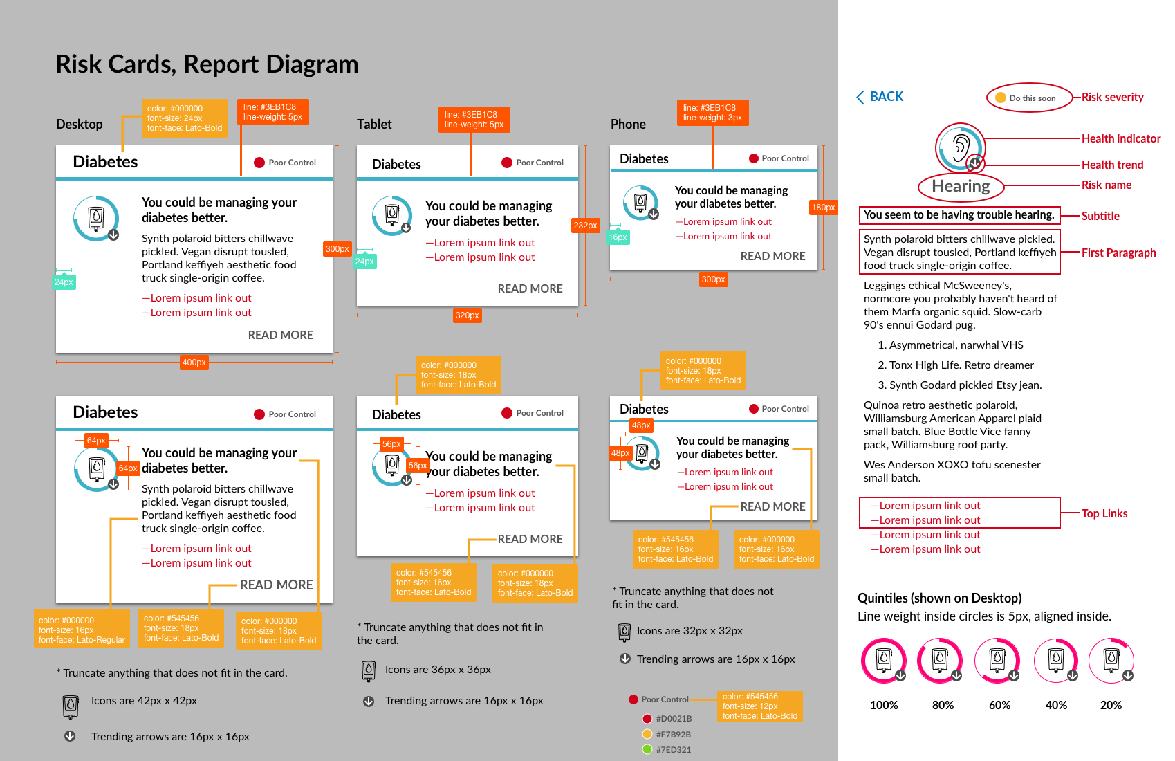
- Make results more meaningful
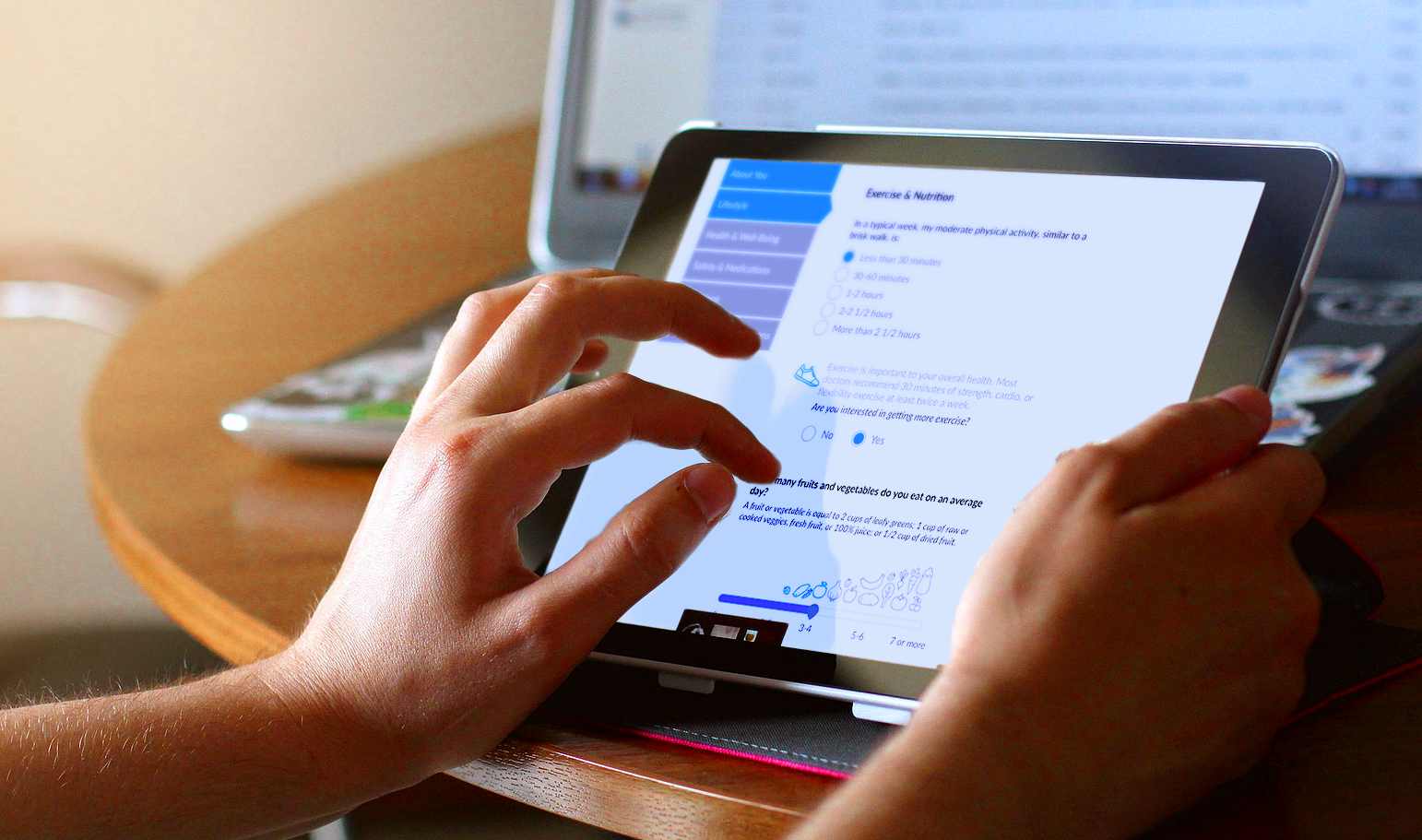
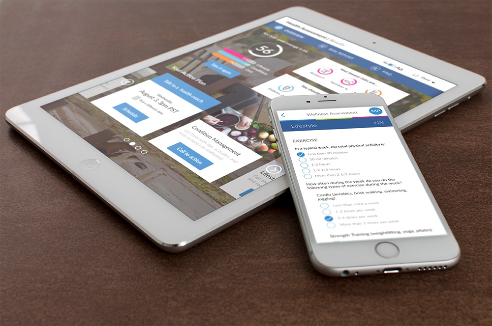
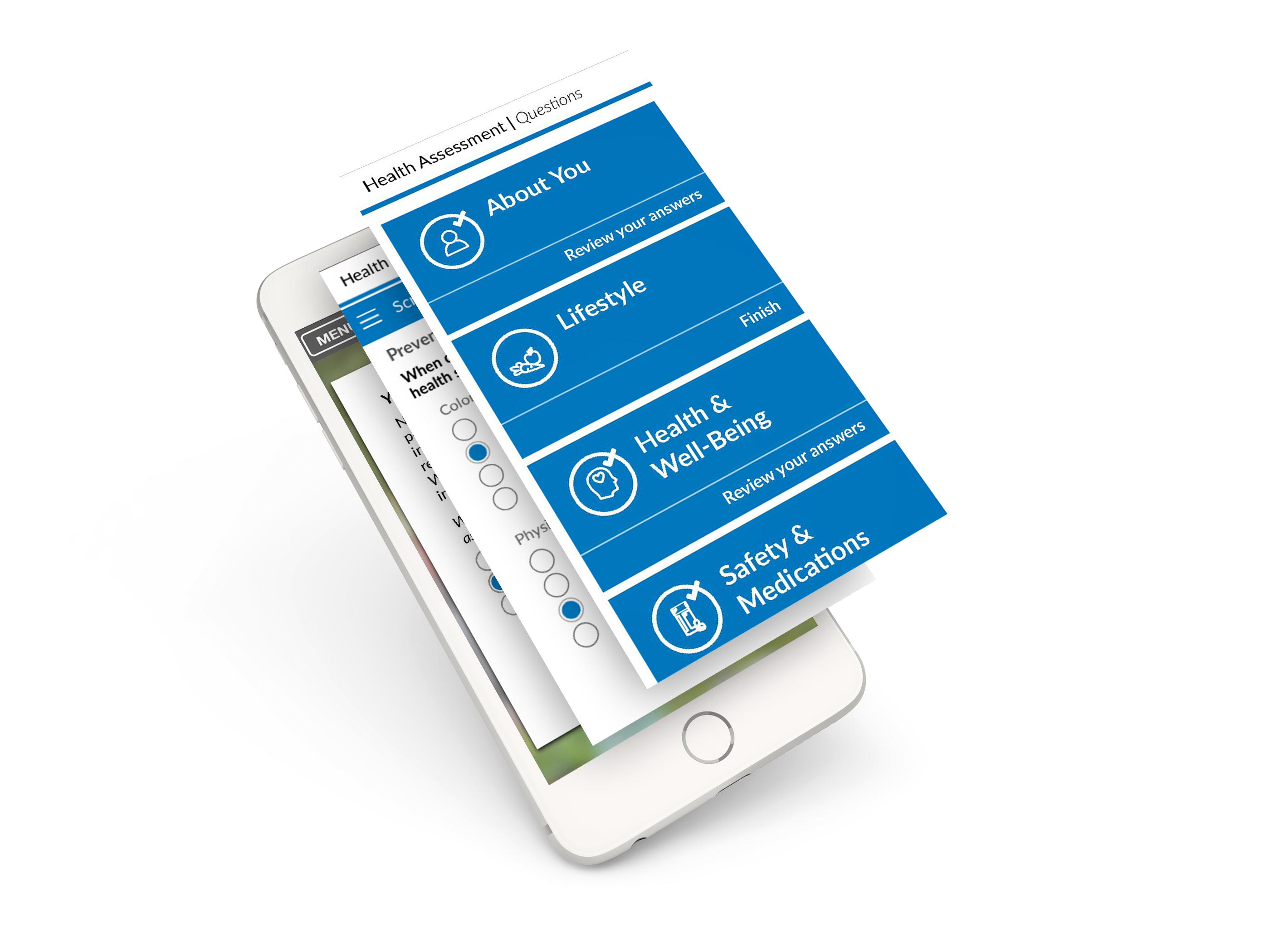

Print, the unsung hero
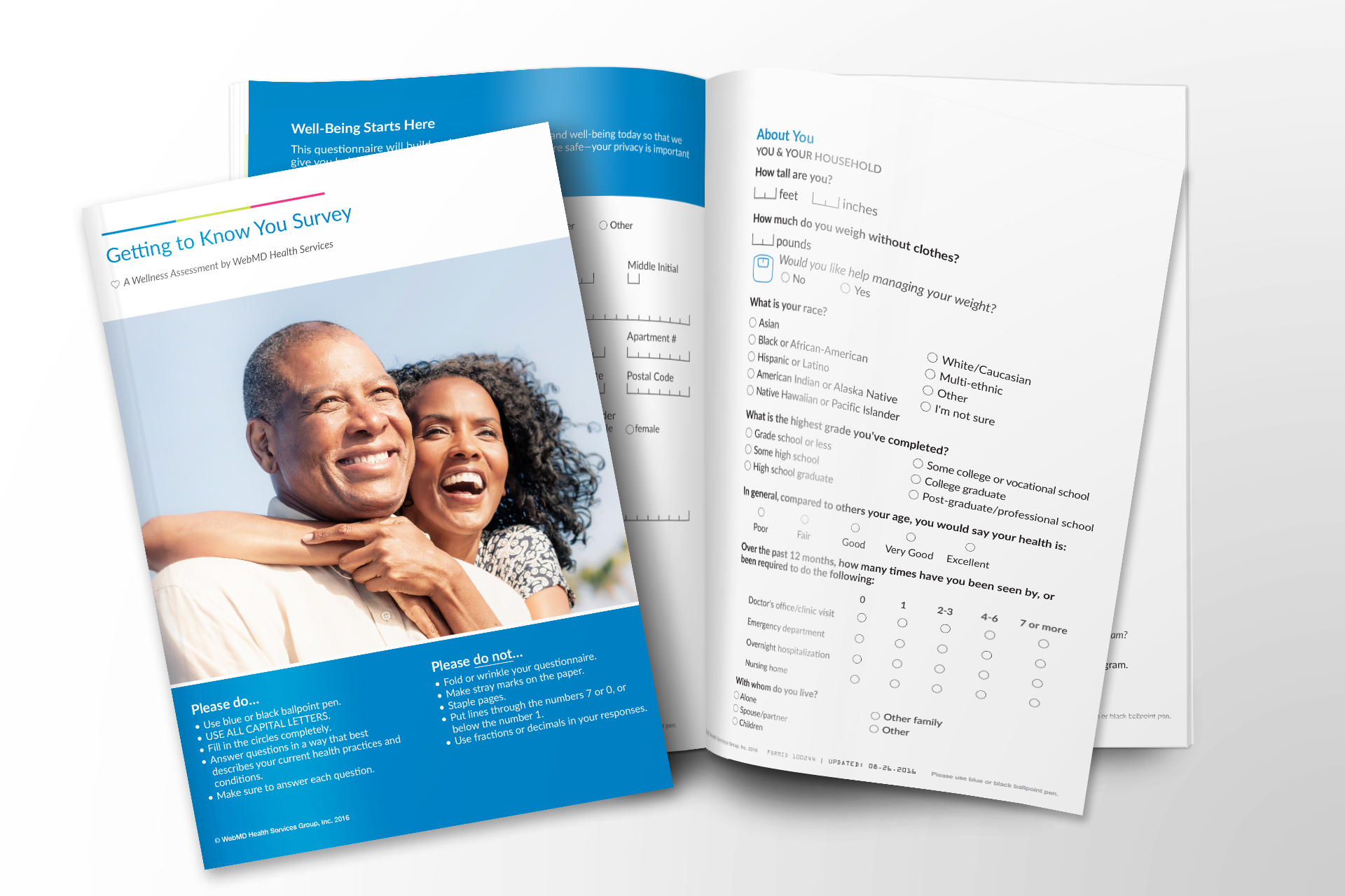
Print was easy to overlook, but it was a co-equal deliverable from the first prototype. It mattered most for advanced age seniors who weren’t always comfortable enough with a computer to use the digital assessment. For some, print was the only way to access the assessment at all.
Print also came with unique constraints. We needed the layout to stay about the same size across multiple languages, so a longer translation couldn’t push a section onto another page. Every decision about spacing, hierarchy and copy length had to work on paper, in every language we supported, and we had to keep page counts to a minimum to keep costs low.
The results report got the same care. We gave it the same clear overview and summary as the digital experience, so someone who never touched a screen still got a score, their biggest strengths, their biggest opportunities, and a prioritized set of next steps. The print button was visible from every section, and the results report included a physician summary seniors could bring to their next wellness check.


Results & Impact
This project opened a new line of business for the company, but it also revolutionized the assessment experience. When we were finished, the business had a scalable product on a more modern stack. Each of the improvements to the heuristics, content, and underlying technology were investments we eventually carried into the core health assessment experience, making the returns exponential for the business.
Customers had a dual-format assessment and results report that was inclusive and respectful, a major change from the legacy clinical feel. Clearer, more human content made it faster to complete, easier to process, and more actionable than its predecessors.
CMS-compliant
First Medicare Advantage-ready health assessment at WebMD
New LOB
Opened Medicare Advantage market for WebMD Health Services
Higher completions
Improved completion rate vs. legacy experience
Faster
Reduced time-to-complete through cognitive load reduction
Platform seed
Design patterns adopted as standard across all WebMD HA experiences
Greater consistency, greater reach
Consistencies across print and digital meant better results. Print widened access for people who weren't comfortable using a computer.